Thursday, October 27, 2016

Graphs using SAS Programming


SAS is powerful business intelligence tools for creating a wide range of business and scientific graphs. Graph is another way to analyze the data and user can easily reach to your conclusion by just look at graph instead of seeing the large dataset.
SAS software contains collection of procedures, sas datasets containing map data, and other utility procedures and application that help manage graphical data and output.
After the version of SAS 9.2 a new family of procedures introduces for creating the statistical graphs. This family of SG procedures includes the SGPLOT, SGSCATTER and SGPANEL procedures. The SG procedures provides detail concept to create graphs commonly used in data analysis in many industries.

So let see how we use these procedures to create the graphs in SAS studio.

SGPLOT PROCEDURE:
The SGPLOT procedure is designed to create a single-celled graph, with multiple plots overlaid within a single set of axes. The SGPLOT procedure is optimized to display overload plots on a single set of axes. For Example:

Scatterplot Graph:
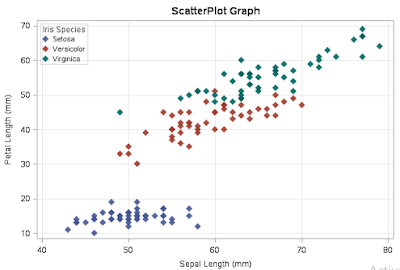
Scatterplot is a type of graph which is best for representing the relationship between two variables.

proc sgplot data=SASHELP.IRIS;

            /*--TITLE and FOOTNOTE--*/
            title H=12pt 'ScatterPlot Graph';

            /*--Scatter plot settings--*/
            scatter x=SepalLength y=PetalLength / group=Species
                        markerattrs=(symbol=DiamondFilled size=8) transparency=0.1   name='Scatter';

            /*--X Axis--*/
            xaxis grid;

            /*--Y Axis--*/
            yaxis grid;

            /*--Legend Settings--*/

            keylegend / location=Inside across=1;
run;
                           
Bar Chart:
Bar graphs provide a visual presentation of categorical data.
proc sgplot data=SASHELP.RETAIL;

            /*--TITLE and FOOTNOTE--*/
            title 'Bar Graph';

            /*--Bar chart settings--*/
            vbar YEAR / response=SALES stat=Mean name='Bar' fillattrs=(color=OLIVE) datalabel=sales dataskin=pressed;

            /*--Response Axis--*/
            yaxis grid;
run;


Line Graph:
Line graph is a type of graph which is used to represent the time series data.
PROC SGPLOT DATA=sashelp.tourism;
            series x=Year y= vsp / LEGENDLABEL='VSP' MARKERS LINEATTRS=(COLOR=OLIVE
                        THICKNESS=2 PATTERN=SOLID) MARKERATTRS=(COLOR=OLIVE symbol=circlefilled);
                        xaxis grid;
                        yaxis grid;
           
            series x=Year y= cpisp / LEGENDLABEL='cpisp' MARKERS LINEATTRS=(COLOR=MAROON
                        THICKNESS=2 PATTERN=SOLID) MARKERATTRS=(COLOR=MAROON symbol=circlefilled);
                        xaxis grid;
                        yaxis grid;
           
            INSET 'Tourism Data Analysis' / POSITION= topleft border;
            TITLE "Line Graph";
RUN;


By using SGPLOT procedure you can plot many graph like series plots, band plots, needle plots and vector plot etc.

SGPANEL PROCEDURE:
SGPANEL procedure created a panel for the values of one or more classification variables. Each graph in the panel can contain either a single plot or multiple overlaid plots.
title1 "Distribution of Cholesterol Levels";
proc sgpanel data=sashelp.heart;
panelby weight_status sex / layout=lattice
novarname;
hbox cholesterol / group=status;
run;


SGSCATTER PROCEDURE:
The SGSCATTER procedure creates a paneled graph for multiple combinations of variables. For example:
proc sgscatter data=sashelp.cars;
compare y=mpg_highway
x=(weight enginesize horsepower )
/ group=type;
run;


This way you can plot lots of attractive graph using SG procedure.

Tuesday, October 25, 2016

Loops in SAS

When we do programming, you want that a block of code is executed several number of times. In general statements are executed sequentially like the first statement in a function is executed first, followed by another statement and so on. In that case we need to understand the concepts of Looping. In Looping there are different keywords to define the iteration or loop statement. The most wee known statement is the “for loop” which is used by many language like C/C++, MATLA, R Java etc. There is similar concepts in SAS like other language to define the loop. But in SAS looping is done by DO Statement. And it is also called DO Loop.  There are four types of DO Statement.

DO Statement

Do Statement classifies a group of statement which execute a group of statement a certain number of times? The syntax for DO statement is
DO;
SAS Statement…;
END


An end statement represents the end of the loop for example:

DATA  _null_;
  do x = 1;
put x =;
end;
run;

Output  x = 1


The output of this program is shown in Log File on SAS. Let take an another example like if I remove the puts statements what you will get?

DATA  _null_;
  do x = 1;
put x =;
end;
run;

Output  x = 1


By default you will get the value of x equals to 1. If I assign more than one value of x like 1, 2,3  then you will see that It print the all the values of x in output.

DATA  _null_;
  do x = 1,2,3;
put x =;
end;
run;

Output x = 1
                   x = 2
                   x = 3


Now I want to apply loop in string values how can I define it.


DATA  _null_;
  do x = “AAA”,”BBBB”,”CCCC”;
put x =;
end;
run;

Output  x = AAA
                   x = BBBB
                   x = CCCC


Suppose we want to print the values from 1 to 100. In that case it really hectic to someone to assign all the values in a particular variable one by one. To solve this issues we have another solution to set the range.


DATA  _null_;
  do x = 1 to 5;
put i =;
end;
run;

output  i = 1
                   i = 2
                   i = 3
                   i = 4
                   i = 5


Iterative DO Loop

The iterative DO Loop executes the statement between DO and End repetively baes on the value of the index values. The syntax for Iterative DO Loop statement is:

DO Index-variable = Start TO Stop <By Increment>;
SAS Statement…;
END

By default, each iteration of a DO statement increments the value of the counter by 1, but you can also use the BY statement option to increment the counter by other amounts. For example, each iteration the following DATA step increments the values by 0.5. For example:

DATA  _null_;
  do i = 1 to 10 by 2;
put i =;
end;
run;

output  i = 1
                   i = 3
                   i = 5
                   i = 7
                   i = 9


DO While Loop

The loop continues till the while condition becomes False. It almost works like the iterative DO statement, except that you don’t need to specify an index-variable or start and stop. The syntax of DO While Loop is:

DO WHILE (expression)
----SAS Statement----
END;

data _null_;
n=0;
do while(n<5);
  put n=;
  n+1;
end;
run;
output  n = 1
                   n = 2
                   n = 3
                   n = 4

In while loop the expression is evaluated before the loop executes, and If the expression is false the first time it is evaluated, then the loop will not execute at all.


Tuesday, September 27, 2016

Building your First R Package


As of late July 2013, there were 4,714 packages on CRAN and another 671 on Bioconductor, with more being added daily. In the past, building a package had the potential to be mystifying and complicated but that is no longer the case, especially when using the Hadley Wickham’s devtools package.

As I have worked with lots of projects, I have built up lots of functions that help me produce result like data tables, graphs that I find useful. But in many cases, it happens that I reuse the function many times that feel really awkward. I have been a fan of the idea of personal R package. 

In this blog we are going too discussed about how to build perfect R package so that you don't have to keep thinking to yourself.

Step 1: Package you will need to create a package are:

install.packages("devtools")
library("devtools")
devtools::install_github("klutometis/roxygen")
library(roxygen2)

Step 2: Create your package directory
# set Path
setwd("C:/Users/admin1/Documents")

# Create Package
create("ownpack")

If you look in your parent directory (i.e. the path that you will set before creating package), you will now have a folder called ownPackage, and in it you will have two folders and one file called DESCRIPTION. The structure should be similar to below image

Step 3: Add Functions in your Package

When you create packages, you need to add function into it. I have some line of code where I am create a function.

#' R_fun Function
#'
#' This function helps you to check whether condition is TRUE or FALSE
#' @keywords ownpack
#' @export
#' @examples
#' R_fun()

R_fun<- function(i)
{
  if(i>11)
  {
    print("Hi condition is TRUE")
  }
  else{
    print("Hi condition is FALSE")
  }
}


After that save this file R_fun-function.R into your R directory. And also create a new file R_fun-package.R in same folder and paste above code into it. The structure looks like

Similar you can add lots of function into your package. I just add only one function so that you can understand better.

Step 4: Process your Documentation 

Now you need to create documentation from your annotations earlier. Firstly set the path

setwd ("C:/Users/admin1/Documents/ownPackage")
document ( )

This automatically adds in the .Rd files to the man directory, and adds a NAMESPACE file to the main directory.

Step 4: Install
Now we are ready to install the package. But before install this package we need to come to our parent directory.

setwd ("C:/Users/admin1/Documents ")
install ("ownPackage")      

Now your package is successfully installed, Now you can also check that your function is successfully work or not
# Include library
library(ownPackage)

# Try this command
?R_fun

# Assign Value
 R_fun(3)
[1] "Hi condition is FALSE"

If you are getting this result it means your function is perfectly work. Basically package building is a great way to make code portable between projects and to share it with other people. A package purely built with R code only requires working function that can pass the CRAN check using check and proper help files that can easily built by including roxygen2 documentation above functions and calling document. Building the package is as simple as using build.
This way you can build your own package in R. 


Friday, September 23, 2016

Plot Interactive High Charts using R

Highcharts is another way to represent the data manually. Highcharts is a charting library which is written in pure JavaScript language. Basically it provides an easy way of adding interactive charts to your website or web application. Highcharts is a product that was created by the Norway-based company, Highsoft.

Currently it supports many types of charts like line, spline, area, areaspline, column, bar, pie, scatter, and so on. 

Advantage:
·       ·        Highcharts have a lots of chart types with same format, style, flavor
·        You can create or modify themes to customize the charts beautifully.
·        Lots of function like tooltips, titles, credits, legends, etc.
·        Provide various chart type with same style scatters, bubble, line, time series, bar graphs, and Heatmaps etc.
·        Piping Style
·        Configure your charts in different ways using themes. There are inbuilt     themes provide by highcharter package like economist, financial times, google,   538  among others.
·        Plugins: motion, drag points,  fontawesome, url-pattern, annotations.
Disadvantage:
  • ·        Faceting is not possible in High charts
  • ·        It uses standard evaluation plot(data$x, data$y) instead something like plot(data, ~x, ~y).

In this post we are going to plot interactive combo high charts in R using rcharts package. In this tutorial we are also using shiny package of R. This package is mostly used to create web application using R language.

As you know in shiny package we have two files (ui.R and server.R). Firstly we try to create a user interface file. 

ui.R

library(shiny)

## Create Data
Tokyo  <-  c(7.0, 6.9, 9.5, 14.5, 18.2, 21.5, 25.2, 26.5, 23.3, 18.3, 13.9, 9.6)
NewYork  <-  c(-0.2, 0.8, 5.7, 11.3, 17.0, 22.0, 24.8, 24.1, 20.1, 14.1, 8.6, 2.5)
Berlin  <-  c(-0.9, 0.6, 3.5, 8.4, 13.5, 17.0, 18.6, 17.9, 14.3, 9.0, 3.9, 1.0)
London  <-  c(3.9, 4.2, 5.7, 8.5, 11.9, 15.2, 17.0, 16.6, 14.2, 10.3, 6.6, 4.8)

## Define UI for application that draws a Combo Graph
shinyUI(fluidPage(
 
  # Application title
  titlePanel("Monthly Average Temperature"),
 
    # Show a plot
    mainPanel(
       showOutput("Graph", "Highcharts")

)))


After created a ui.R script, now come to server.R file.

server.R

library(shiny)
library(highcharter)

# Define server logic required to draw a Combo graph
shinyServer(function(input, output) {

# High Chart code for Plotting the Combo Graph
output$Graph <- renderChart({
    h1 <- Highcharts()

   # Tokyo Line Graph
    h1$series(data = Tokyo, type='spline', name='Tokyo')

   # New York Line Graph
    h1$series(data = NewYork, type='spline', name='New York')

  # Berlin Line Graph
    h1$series(data = Berlin, type='spline', name='Berlin')

  # London column Graph
    h1$series(data = London, type='column', name='London')

   # Set Legend Layout
    h1$legend(layout='vertical',align='right',verticaAlign='top',borderWidth=0)

   # Add xAxis label in a graph
    h1$xAxis(categories=c('Jan', 'Feb', 'Mar', 'Apr', 'May', 'Jun', 'Jul', 'Aug', 'Sep', 'Oct', 'Nov', 'Dec'))

    h1$set(dom='Graph')
    h1
  })
 
})

There are lots of things and options to do with high charts. You can refer this link Highcharts options to get more information about function in Highcharts.

When you save both file and click on RunApp button, you will get same output as you see in below image.


When you will go to any point then it will show to the information regarding to that point. You can also visit http://www.highcharts.com/demo/  website to take demo for interactive high charts. 


Highcharts gives superb web design with high adaptability, and the highcharter package permits R clients to take full advantage of them. In case you're keen on discovering more about the usefulness of the package, I very prescribe perusing the highcharter package homepage page which contains an different variety of Highcharts, Highstock and Highmaps plots alongside test code to recreate them. 


Creating Compelling Pie Charts in Looker: A Step-by-Step Guide with Examples

Creating Compelling Pie Charts in Looker: A Step-by-Step Guide with Examples   In the realm of data visualization, pie charts are a clas...